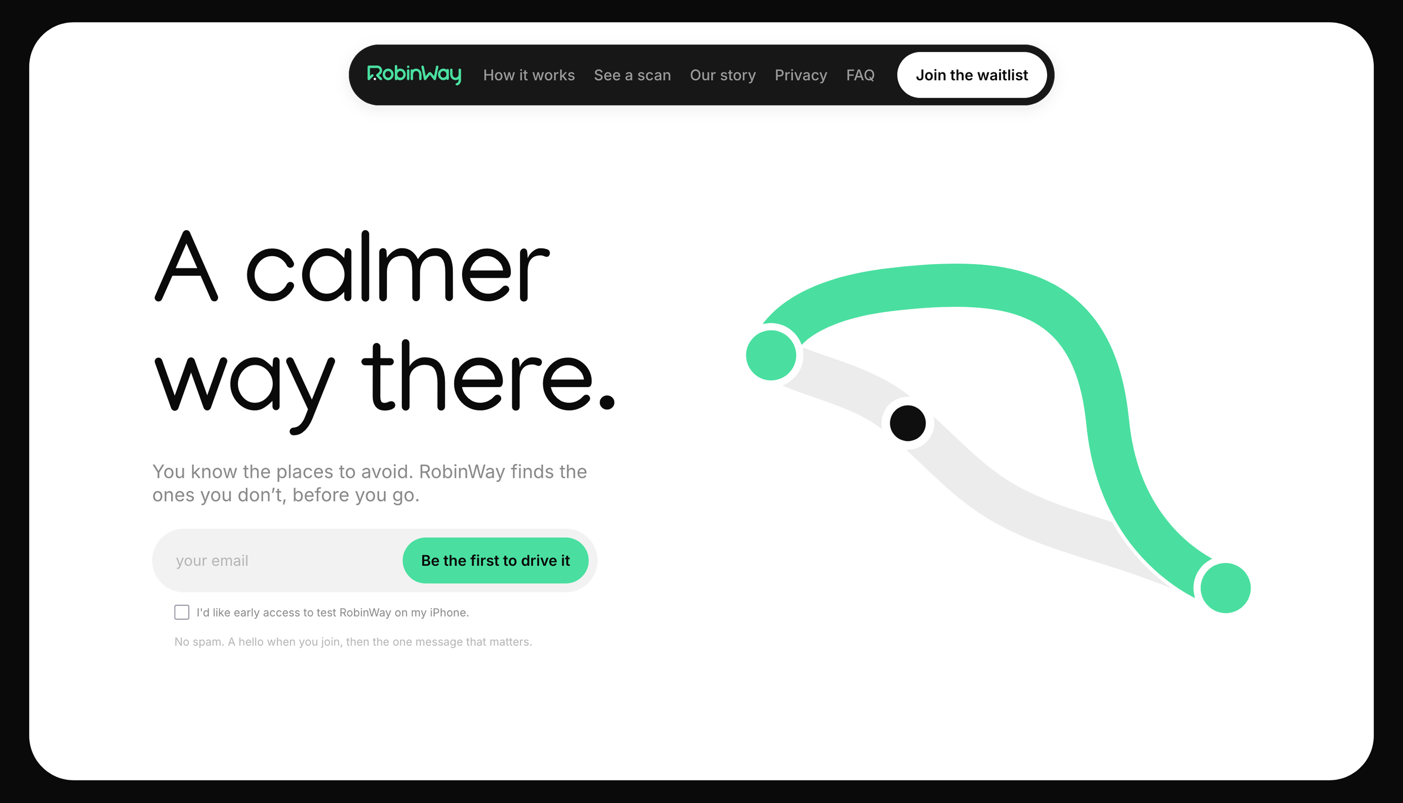
RobinWay is a native iOS navigation app for caregivers of autistic children. Before a drive, it checks every route to the destination for the places a family has learned to steer around, scores what it can and cannot see, and hands over the calmest way there. I designed it end to end: the product, the design system, every screen, and the words. It reached TestFlight in 2026, navigating real drives on real roads.
It started with a text message
RobinWay started with a text message: “Do you want an app idea?” Robin, a mom raising four autistic children, already drove the route no map would suggest, cutting through a forest to avoid the places she knew by heart. That map of places lived in her head. She built it one drive at a time, and it only ever covered the roads she knew.
Every navigation app on the market optimizes the same variable: time. Robin optimizes a different one. A ten minute detour that avoids a meltdown is not a slower route. It is the better route, and no product on the market could see that. That inversion, calm over speed, is the whole design problem, and it touches every screen in the app.
Unknowns are flagged, never hidden
The core design decision in RobinWay is that the app reports uncertainty, and gives it the same weight on screen as a known risk. It checks routes using places data and AI vision on street imagery, and sometimes it genuinely cannot tell what is visible from the road. The easy design move is to stay quiet about that and let silence read as safety. For this user, that silence is a betrayal waiting to happen on the road.
So every place along a route resolves to one of three verdicts: avoided, risky, or unknown, and unknown is shown with the same weight as the others. Routes themselves carry the same honesty. A scan is either fully checked or best effort. Fully checked means every check RobinWay ran came back clean, a claim about its own coverage, not about the world. When some checks could not finish, the app says “best-effort scan” and counts exactly what it could not see. When no clean route exists, it declines to pretend otherwise.
The scan itself shows its work. While RobinWay checks a drive, the progress screen names each step in plain language: finding routes, checking nearby places, looking at Street View along each route, scoring. The screen carries a one line promise that became a design principle for the whole product: RobinWay shows you exactly what it is checking. No magic, no guessing.
The caregiver stays in command
An app like this has one catastrophic failure mode: a caregiver takes its word for a route, stops thinking, and gets surprised anyway. The design treats that as a structural problem, not a copywriting one. You cannot start a drive in RobinWay without passing through a checkpoint that summarizes what was found, what was avoided, and what is still unknown, and the button that starts navigation says what it means: “I understand, start the drive.”
Fewer surprises. Not a promise of none. RobinWay is a planning tool, not a promise.
That line is from the product’s own marketing site, and it was written before most of the interface. Getting the honesty posture right first made the screen level decisions almost mechanical: if the product does not promise certainty, no screen is allowed to imply it.
A map designed for a stressed reader
The navigation view assumes the worst reading conditions the product will ever face: direct Arizona sun, a stressed driver, glances measured in fractions of a second. The basemap is nearly achromatic, so the single spring green route line is the only saturated thing on the glass. Risk verdicts are encoded in shape and symbol as well as color, a circle with a check for cleared, a diamond for risky, a hexagon for unknown, an octagon for critical, so the system survives color blindness and sun glare without a legend.
The same discipline runs through the palette. Ink, a near black, and Spring, the green, are the brand. Risk colors are desaturated so an amber marker reads as information, not alarm. A product for lowering the temperature of a drive cannot have an interface that raises it.
The build, honestly
I did not hand-write the Swift. The app is native SwiftUI with a custom navigation stack, and it was built through AI-directed development: I designed every screen, defined the design system and the interaction rules, wrote the product copy, made every product decision, and directed the build in code, verifying each piece on device and on real drives. The judgment about what to build, what the states mean, and where the honesty lines sit is the design work, and it is mine. The typing is not the job. Knowing what to type toward is.
One limit belongs in the same breath. All the verification was mine: on-device testing, real drives, caregiver testing. That validates the product, not the implementation. Nobody else had reviewed this code, and a solo AI-directed build does not get to skip that step. It just had not taken that step yet.
That method is the same one documented in the ionite case study, pointed at a harder target: a domain with real safety stakes, a native platform, and a user whose trust cannot be won back once lost.
On the road
RobinWay went to TestFlight and was being driven daily against production infrastructure: native turn by turn navigation, live route scanning, and re-checks when the route changes. The marketing site was built and in review with Robin, whose family the product is named for. The App Store was the next milestone.